Reeduc
Description
An intuitive and user-friendly healthy eating app that encourages a healthier lifestyle. Developted during the UX Design training course at Mergo User Experience, we collaborated to create and execute this project that we proudly named Reeduc.
Client
Reeduc
Year
2021
Type
UX Design

The Design Thinking methodology chosen to work on this project was the Double Diamond. It is a useful framework for approaching UX design projects because it emphasizes a user-centered approach, provides a structured process, encourages collaboration and creativity, and allows for iteration and refinement based on user feedback.


Longest step of the process that involved semi-structured interviews, insight cards, persona mapping, touchpoints, pain points, expectations and frustrations of users.
CSD Matrix
We started the project with a Desk Research to find useful data on food re-education. We gathered the data found and separated them into a CSD Matrix (Certainties, Assumptions and Doubts). Tool which helped to understand the scope of the challenge in question, and which would later serve as the basis for semi-structured interviews with real users.

Modeling
With the information on hand, we started an audience hypothesis, which would help us to have a perception of who our users would be. We started then by asking ourselves: ⦁ Who are the users of our product? ⦁ What are their goals? ⦁ What tasks do they perform? We created three hypothetical people: Disciplined, Determined, and Undisciplined. We focused on the "Determined" group; which would be those who wish to change, would like to seek food re-education and, consequently, would benefit from our product.


Quantitative research
With the choice of the hypothetical person "Determined", we prepared a survey to better understand his profile. This questionnaire was disseminated on social networks and WhatsApp groups, with a return of 277 participants.


Qualitative research
We focused on these specific points on the form and decided to go deeper with qualitative research, seeking to better understand the scenario in which that person found himself: If there was a routine and what it was like, food preferences, main hobbies, why they were concerned with health, among other questions. We interviewed 3 women with very different profiles.

Persona
With concrete data collected, we were able to better visualize who our persona would be and what pains we would like to solve. Unlike modeling when we were just guessing what this profile would be like, but still without data that really proved such assumptions.


Analysis stage of the content generated in the empathy phase, to prioritize pains and make sure the right problem is being solved.
User Journey
By mapping the user's journey, we were able to define the steps of the process, before, during and after the journey; user interactions at all points of contact, existing barriers and opportunities for actions.
Opportunities
After understanding the points of contact in the journey, we were able to visualize more effectively the opportunities, motivations, uncertainties and barriers that we would face before starting to ideation.
Group reflection stage that utilizes various techniques such as brainstorming, mashups, and task flows to generate and refine ideas that support the creation of a low-fidelity prototype.
Action Plan
After defining the opportunities, the action plan was drawn up based on 5 main questions:


Task flow
At this stage, we elaborated the flow of tasks that the user would do in our application, in a way that would engage the user and encourage him to complete the proposed tasks.

Crazy Eights
With the aim of sketching out as many ideas as possible in a very short time, we carried out this practice that is part of the Design Sprint methodology.


Step of adapting and transforming the solutions foreseen in the ideation stage into visual interface elements, using design techniques to promote flow and understanding of the use of the tools.
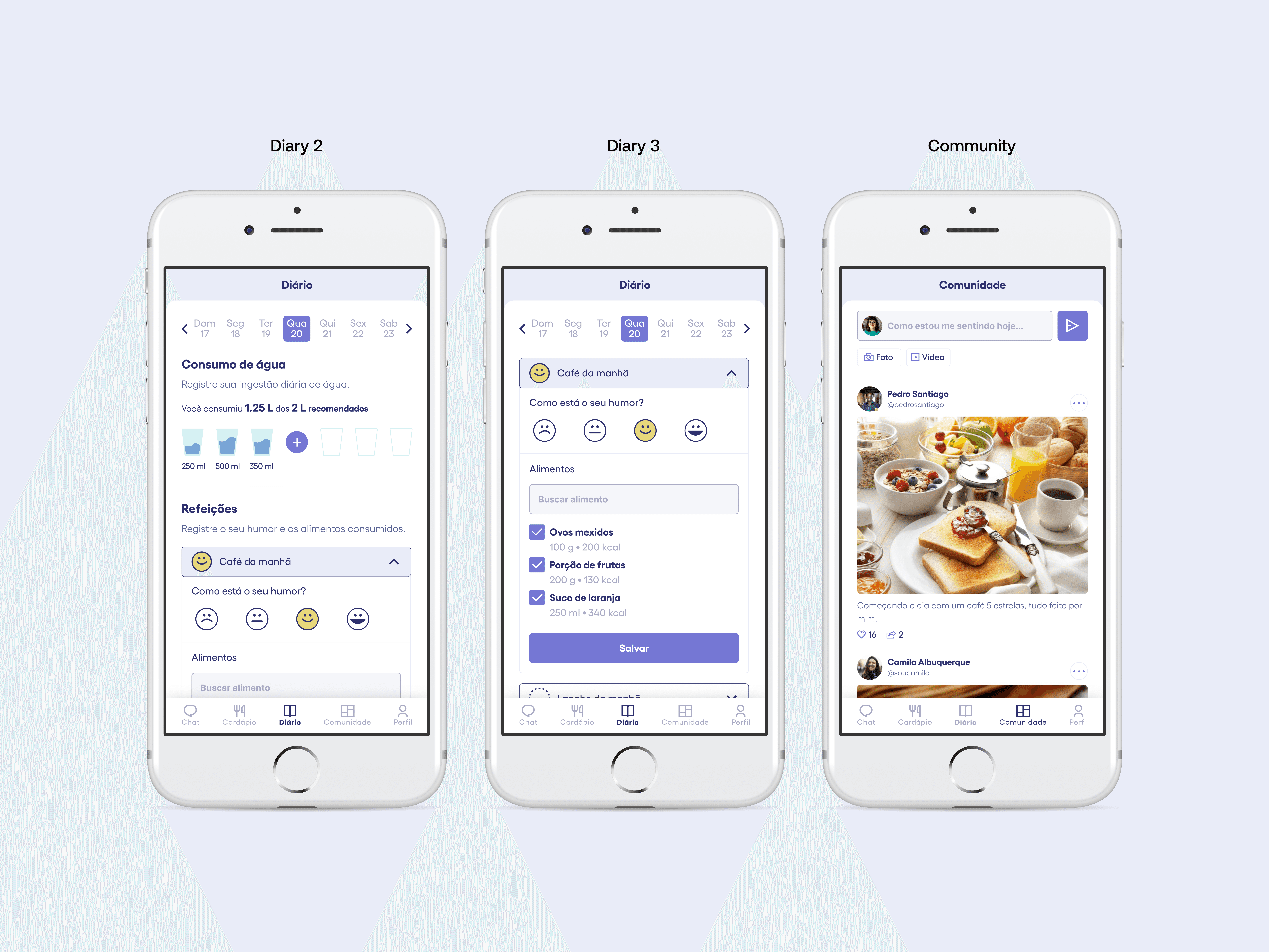
Low Fidelity Prototype - Paper
Based on the task flow and all the material gathered so far, we started designing our solution and our MVP. We initially developed a prototype on paper, later digitizing it in the Marvel app; and then, based on the 10 Nielsen heuristics, we made the first adjustments.


Nielsen Heuristics
Evaluation of the user interface design to identify and address any potential usability issues, ensuring that the system is easy to use, efficient, and meets the needs of the users. These adjustments typically focus on improving areas such as visibility of system status, user control and freedom, consistency and standards, error prevention and recovery, and help and documentation.
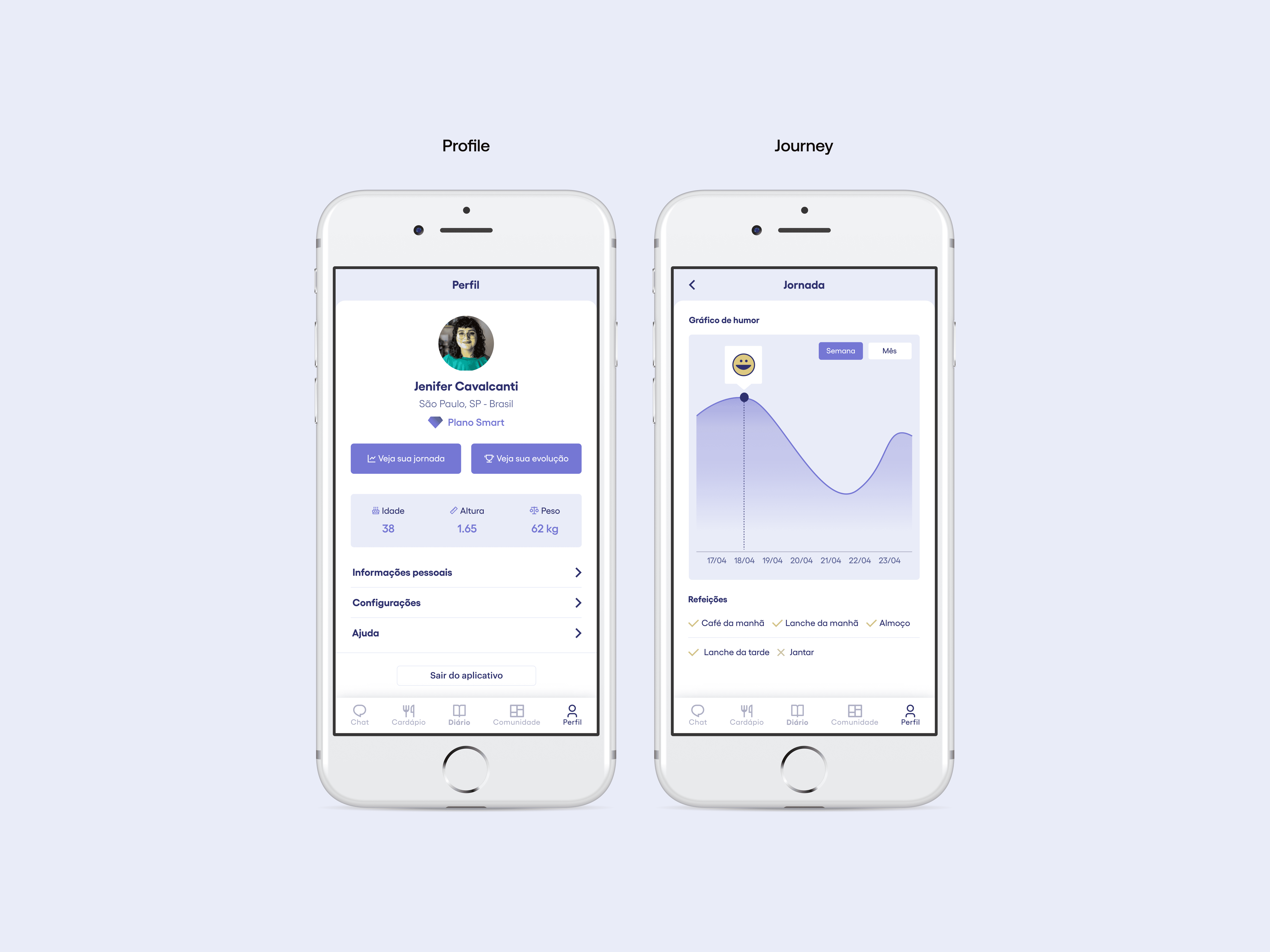
Medium Fidelity Prototype
After the paper prototype, we decided to develop a representation closer to the real objective, simulating the flow of some functionalities, which allowed us to test more tasks and follow the user's interaction.


Accessibility
We conducted contrast accessibility tests to incorporate in the next iteration. Although we used a contrast checker website, there are numerous other tools available for conducting this type of analysis.

With the first low-fidelity prototype ready, we submitted it to usability tests with real users who provided information to restart the cycle.

Usability tests
Already with the first navigable prototype, we carried out tests with real users to personally follow the way they interacted with the screens while expressing what they were seeing, feeling and understanding. To carry out the usability test, which was carried out with 3 users, we set up a script that had the following structure: ⦁ Initial questions about the interviewee's routine; ⦁ Usability test with 5 tasks.

Results
After carrying out the tests with the users, we can arrive at the following results: ⦁ The mascot was highly rated but we should make improvements in terms of gamification, and give it more prominence within the app; ⦁ The evolution graph was not so well evaluated. Maybe leave it longer detailed and fun for a second test and depending on the result, review this feature; ⦁ When recording content in the diary, the dotted space that is filled in by a emoji at the end of the registration, was interpreted as a button by the users; ⦁ The community's evaluation had scattered results, probably because we only spoke with 3 people. It would be worth doing the test with more people to have a more assertive result; ⦁ Some terms used would need to be revised, such as "community and chat". There was a lack of clarity about the functions of these buttons.
Learnings and new hypotheses: ⦁ Recruit more people for interviews and tests; ⦁ To avoid misleading the user, it's important to practice more; ⦁ MVP was still a bit extensive, with too many features. Did we actually solve our user's problem, or did we just do part of this path?Would the user stop using our application after being able to control anxiety and eating?
This project turned out to be a challenging and rewarding first experience for me, where I was able to develop my skills in UX, as well as reaffirm the impact that good design can have on users' lives, even being able to change habits.